I’m excited to start sharing with you my completed Week in the Life album. I’ve made a lot of progress and hopefully I’ll be finished with the whole thing within a month!
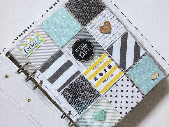
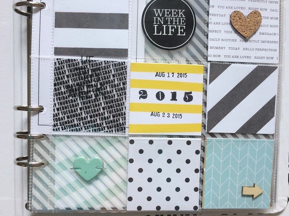
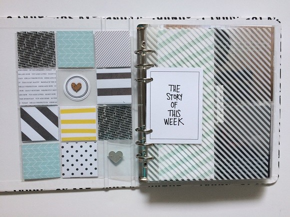
For my album, I used mostly Ali’s kit. Here you see the title page, on which I decided to just play with paper. I think it’s cute. :)
Before we got into the details of the week, I wanted to briefly give some info about each of us. I basically just wrote our ages and what we’re into right now off the top of my head.
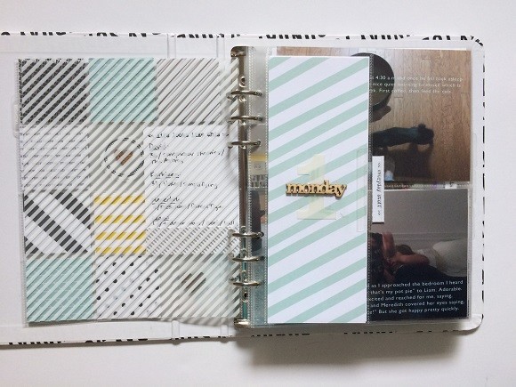
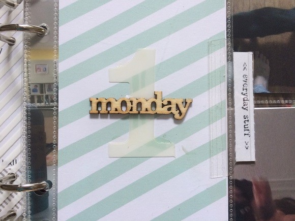
I love the transparent dividers that came with the kit since I preordered. For the beginning of each day I decided to follow a plan: divider, then a 3×8 page with the day number and wood veneer day of the week. And I love adding the tabs to the side of smaller pages.
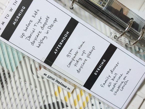
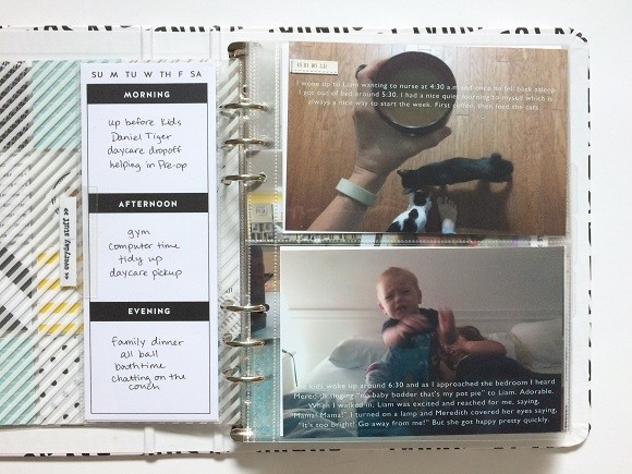
On the back of the 3×8 I used this insert. On some future days I’m using it for more photos, but otherwise I just list an overview of our day.
This is my second year completing this project, and there are two main things that I love about this album compared to last year’s. First of all, I printed my photos in color for the most part. Last year I did all black and white, which I thought would be cool but ended up being boring.
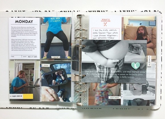
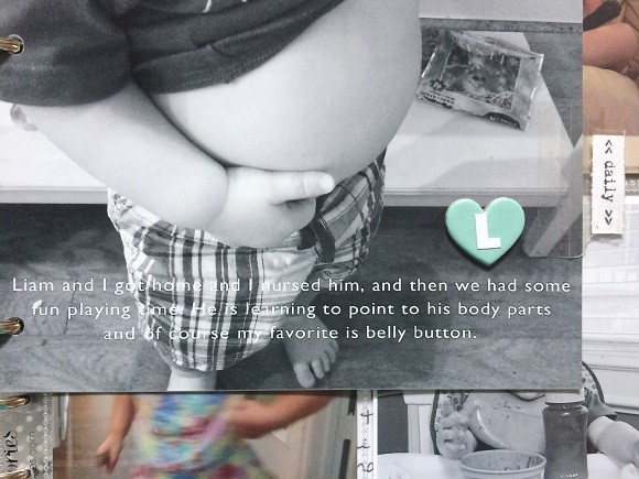
Secondly, I typed up journaling on many of the photos before printing. This took more time at the beginning because I really had to plan the entire album before printing, but it’s making things so much easier now. Not only do I have to do less handwriting, but it’s also saving a lot of space. All of the journaling I did was taken directly from each day’s blog post.
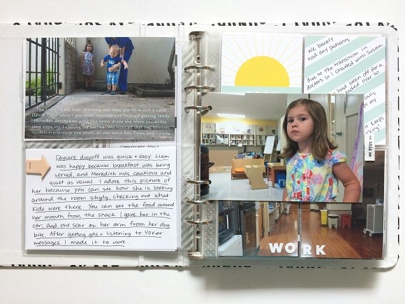
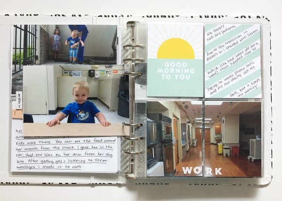
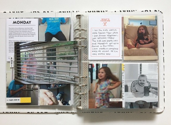
Since I had more photos than page protectors, I punched holes in some and put them right in the album. This was Ali’s idea and I thought it was awesome.
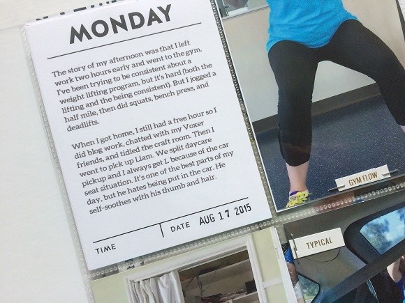
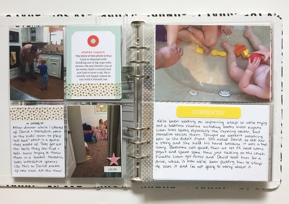
For these daily cards I typed my journaling. To do so, I have a template set up in PSE, then I just lightly tape the card down to my paper template, and print. Here is how I learned to do it.
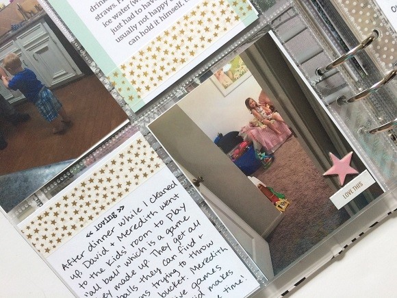
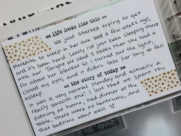
I just used simple embellishments throughout. I like the mix of handwritten and typed journaling.
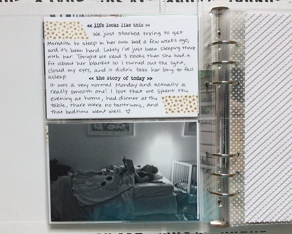
Most of my nighttime photos I converted to black and white because the lighting was bad. The lamp on the wall in the kids’ room gives a greenish tint. But I loved how this one turned out!
That’s it for my Monday in the album. Thanks for letting me share!
Supplies used:
Week in the Life kit with black/white album
Avery Index Tabs
Tools used:
StazOn Inkpad
Crop-A-Dile
Tiny Attacher
Pentel Energel
Date stamp
Tombow Mono Multi Liquid Glue
Fonts used:
Gill Sans (on photos)
Aleo (on cards)

Leave a Reply