Welcome to my first Project Life post of 2015! Before I share my pages I have a couple things to share about how I’m structuring my album and how the process will go for me.
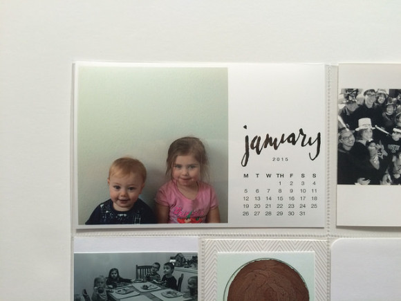
I know I said I was going to keep everything basically the same as last year, but I wanted to change up the title cards. When I saw these monthly calendar templates I knew they would be perfect, and I decided to add a picture of the kids in the same basic pose for each month. But these were monthly title cards and I usually complete a spread every two weeks. Sooo…I’m doing a mixture.
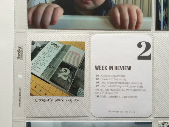
What I mean is, I’m only going to have a title card each month, and looks like I’ll only be blogging my pages once a month. But I am still going to keep up my habit of ordering photos and completing spreads every two weeks. I am also still using the week in review cards.
Am I worried about the times when the weeks won’t line up exactly with the months? Yeah it’s kind of bugging me right now…but I’ll deal with that when I get there.
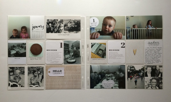
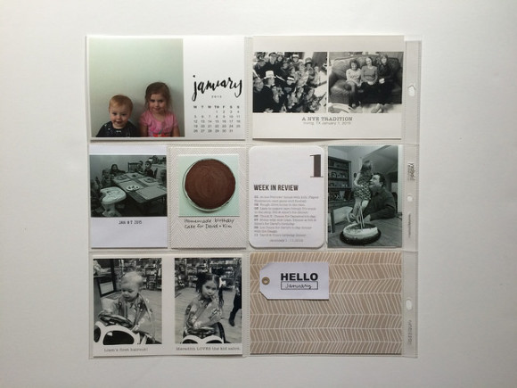
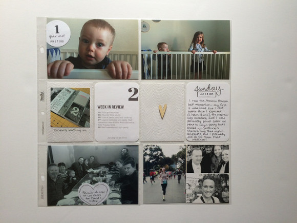
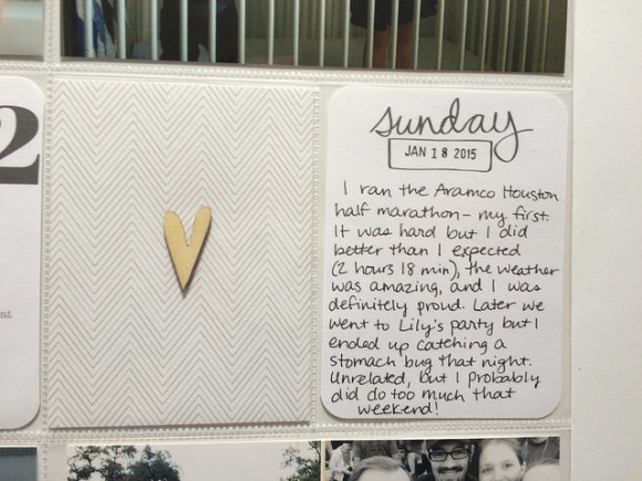
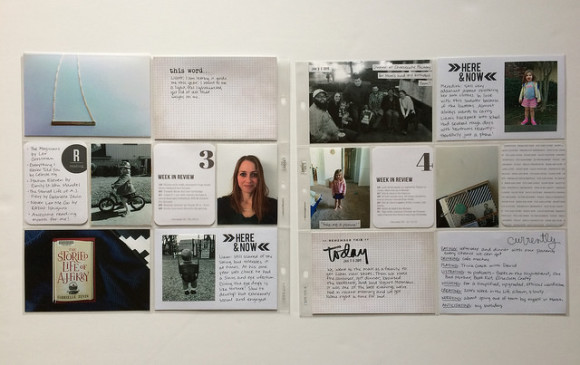
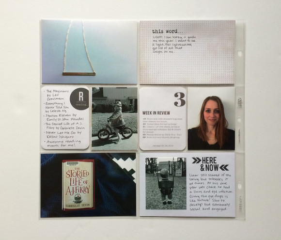
So here is my first spread, which roughly encompasses January 1 – 18. Let me tell you, when I first printed my photos for this and laid them out, I hated the way it looked. There were a lot of bright colors and no white space and it was just ugh. January is also a suuuuper busy month for us so there was a lot to pack in.
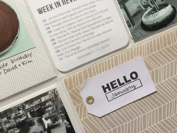
Usually when I don’t love the photos I’ve printed I just throw them in the pockets anyway just to get it done, but I had such strong negative feelings this time, which made me sad because I loved the title card so much! So instead I turned several of the photos to black and white, then combined them in collages and re-printed them at home using my Canon Selphy. I was so much happier then. :)
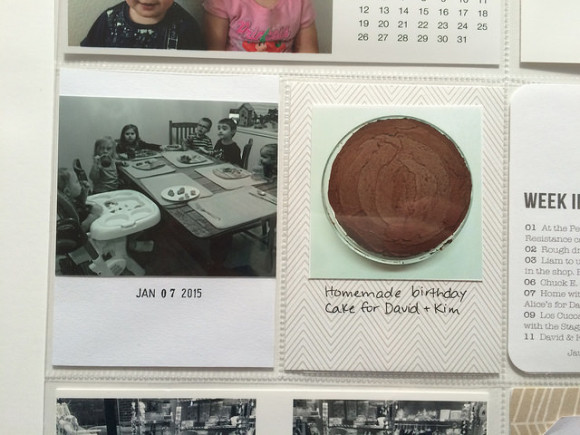
Another trick that helped the layout feel less “busy” was that I cropped several of the photos down and adhered them to paper (like the two above).
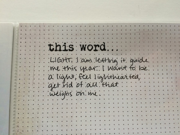
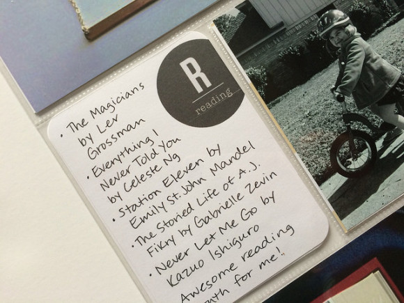
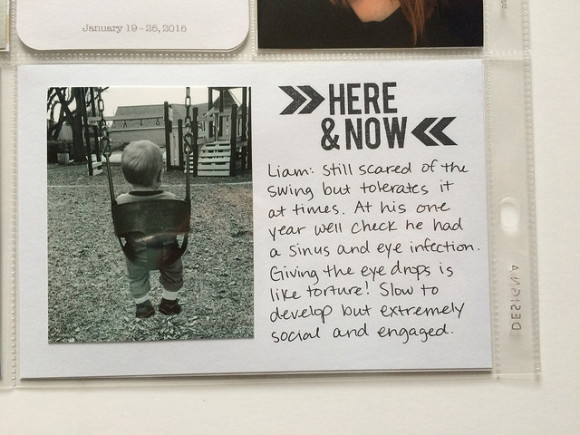
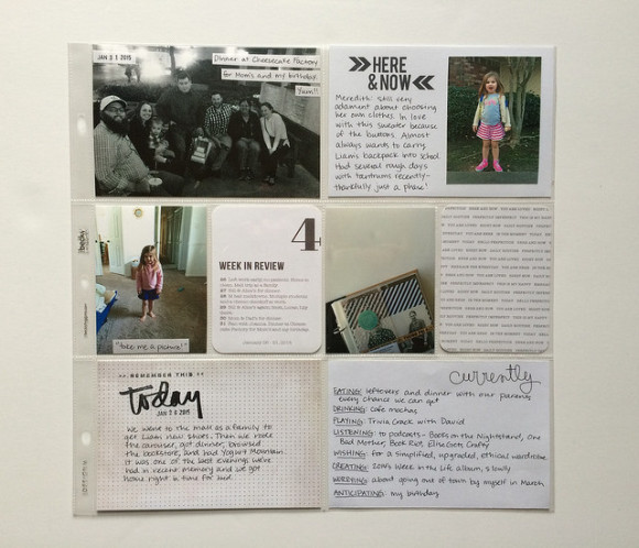
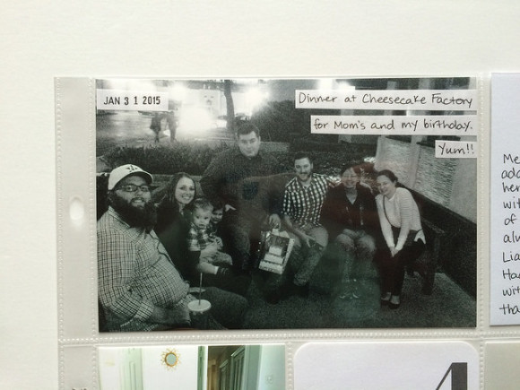
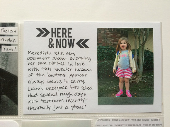
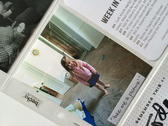
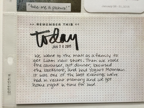
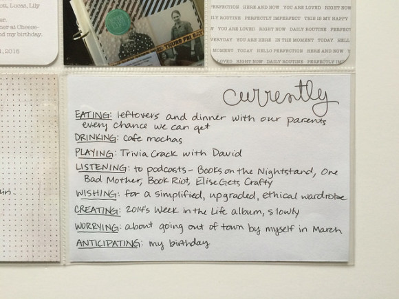
Now onto the second spread, which is for January 19 – 31. I totally neglected my camera for a couple of weeks! I really had to think creatively to fill these pockets. Instead of shoving them all on one page, though, I was glad for the extra space to journal. It allowed me to include some tidbits that I otherwise probably wouldn’t have written about, like the books I read that month and a family outing that was especially fun.
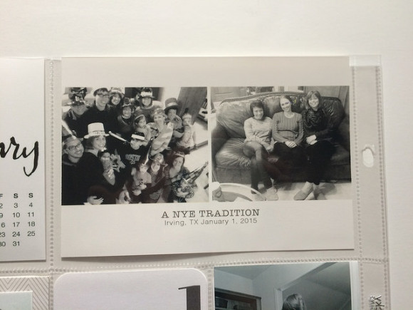
The above is a classic “dad photo.” Anytime our family gets together he always takes group shots. I love that he does this but he is never in the photos and also they are usually dark, blurry, and/or far away. ;)
So that’s that! I am still having a lot of fun with this project and I love that there is room for experimentation but I can keep it super simple and still be in love. Next week I’ll be sharing more about my entire memory-keeping framework. Thanks for reading!
Leave a Reply